Five design laws informed by psychology
The designer’s job is to imagine the world from the user’s point of view

At 4am on 28th March, 1979, a quiet signal light in a Pennsylvania control room masked the beginnings of America’s worst nuclear accident. At the Three Mile Island plant, a critical valve jammed open, draining coolant from the reactor core. However, the control panel light, designed to show whether a command had been sent, falsely reassured operators the valve was shut. As steam hissed silently from the core and temperatures soared, engineers, overwhelmed by a confusing array of dials and indicators, made decisions that worsened the crisis. The interface didn’t display the real state of the system, only what the operators thought they’d told it to do. By the time they realised the truth, the core had melted, radioactive gas had leaked and the world’s faith in nuclear safety had cracked. This was sparked by a misleading light bulb and a poorly designed control panel.
💡 Psychology informs good design
It's very easy to be different, but very difficult to be better. - Jony Ive
Exceptional user experience doesn’t happen by accident. It is grounded in human psychology, a deep understanding of how people interact with products and thoughtful design. There are five design laws I keep in mind when developing websites, apps and other digital products.
1. Fitts’ Law
The smaller and farther away a target, the longer it takes to hit it. - Steve Krug
💡 The time it takes to reach a target, e.g. a button, depends on its size and distance from the user’s current position. Bigger and closer elements are easier to interact with.
🎬 Design frequently used buttons larger and position them for easy access, e.g. within thumb reach on mobile devices. Align key elements with user expectations by placing them in familiar, intuitive locations, e.g. bottom of the screen. Ensure touch targets are well spaced to limit accidental taps.
2. Hick’s Law
Minimise choices to avoid overwhelming users and slowing them down. - Jakob Nielsen
💡 The more options you present to a user, the longer they’ll take to make a decision. Reduce the mental load by limiting choices and simplifying decision-making.
🎬 Keep interfaces clean and decisions simple. Limit the number of choices presented on a screen to avoid overwhelming users. Apply progressive disclosure to reveal options only when they become relevant. Organise related options into clear groups to support quick scanning and intuitive navigation.
3. Jakob’s Law
The more your design patterns match user expectations, the more intuitive your product becomes. - Steve Krug
💡Users expect your product to behave like other products they’ve used before. They bring mental models, preconceived expectations, into every experience.
🎬 Use familiar design patterns for navigation, buttons, and layouts to create a more intuitive experience. Avoid redesigning standard User Interface elements unless there's a clear benefit. Maintain consistency in style and functionality across all pages and devices to support user confidence and ease of use.
4. Miller’s Law
The span of absolute judgment and the span of immediate memory impose severe limitations on the amount of information that we are able to receive, process, and remember. - George Miller
💡 Humans can hold about 7 (plus or minus 2) items in their short-term memory. Overloading users with too much information at once hinders their ability to complete tasks.
🎬 Organise content into smaller, manageable sections using formats like bullet points or tabs. Apply visual hierarchy to draw attention to the most important information. Cluster related elements together to enhance comprehension and streamline the user’s processing of content.
5. Law of Proximity
When we see elements placed close together, we tend to perceive them as a group, even if they differ in colour, shape or size. - Jeff Johnson
💡 Visual elements that are close to one another are perceived to be related.
🎬 Group related elements using spacing. For instance, when designing a form, position labels near their corresponding input fields to clearly show users where to enter specific information. This spatial alignment helps reduce confusion and improves usability.
🎬 Applying design laws
These design laws are more than abstract theories for me, they’re practical tools. Here’s how I integrate them into my workflow:
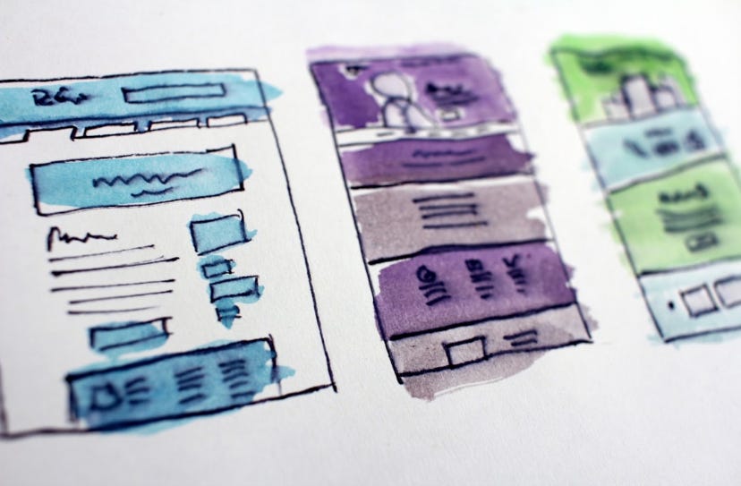
Wireframes: I use the Law of Proximity to group related elements for easy scanning and apply Miller’s Law to limit on-screen information.
Prototypes: I follow Fitts’s Law by making key buttons large and easily accessible, especially on mobile. Applying Hick’s Law choices are minimised, showing only what’s necessary at each step using progressive disclosure.
Usability testing: I watch for confusion that signals a violation of Jakob’s Law where users expect familiar patterns.
Other resources
A Conversation with Jony Ive interview by Patrick Collinson
Applying Game Design Rules to Apps post by Phil Martin
Three Data Visualisation Tips post by Phil Martin
Design is not just what it looks and feels like. Design is how it works. So said Steve Jobs.
Have fun.
Phil…