4 Visual design principles
Proximity, Alignment, Repetition, Contrast

(Here’s a fancy web version of this post.)
This post outlines a simple framework for thinking about visual design and illustrates how I applied it in one of my mobile apps, Scarper. The four design principles are covered in more detail in The Non-Designers Design Book by Robin Williams.
The visual design of an app is key to aiding user understanding and enhancing brand identity.
Proximity
It is a mistake to attempt to fill all available space on a screen. Rather, spacing between individual or groups of items significantly enhances the way users interpret what they see. Items with a strong relationship between them should be physically close and are perceived by users as a single unit. This provides a clear structure and is a key part of an aesthetically pleasing design.
Alignment
An item on a screen should relate to all others, to establish a visually cohesive whole. Nothing should be placed arbitrarily. Alignment of items, usually horizontally or vertically via invisible lines we construct in our minds, signals a visual relationship between them.
Repetition
Items should be repeated throughout the visual design of an app, both within and between screens. The repeated characteristics can include colour, font, shape, line with, spacing, texture and graphic themes. This enhances unity and a sense of organisation.
Contrast
If two items on a screen are intended to be visually different then they should be significantly different, i.e. they contrast with each other. The characteristics of the items to facilitate this includes one or a combination of: colour, size, shape, font, line width, spacing or texture. Contrast provides a hierarchy for elements and is one of the most effective ways to make an app visually engaging.
Principles in practice
To bring the design principles to life, I explain how they apply to the main play scene in my game Scarper.
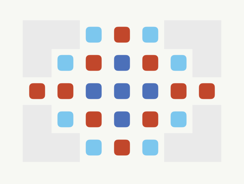
In the grid play scene (below) there are three regions:
Top: Moves available and the target for each coloured tile
Middle: The Grid which includes coloured tiles
Bottom: Shuffle tiles button (left) and Settings button (right)

The top, middle and bottom regions illustrate an application of the proximity principle, where similar items are grouped together. Each coloured tile is the same shape and size (repetition principle), but are differentiated by colour (contrast). The tiles align both horizontally and vertically to form a grid in the middle of the scene (alignment). The buttons at the bottom of the scene are the same size and colour (repetition) and their function is distinguished by their respective icons.
Other resources
Principles of Visual Design in UX by Kelley Gordon
Principles of Design by Cameron Chapman
In next Sunday’s post I’ll talk about options to make money from mobile apps.
Until next Sunday, see if you can spot how the design principles are applied in the apps you use.
Phil…